- About
- Shopping
- Articles
Take your pick!Exploring Each Type
Hobonichi Techo Weeks
Weekly Pages &
Memo Pages
![]()
Dual-spread design
The weekly spread contains the weekly calendar on the left page and the blank graph paper on the right page. This helpful layout allows you to easily view your schedule at a glance while taking notes and drawing plans.
![]()
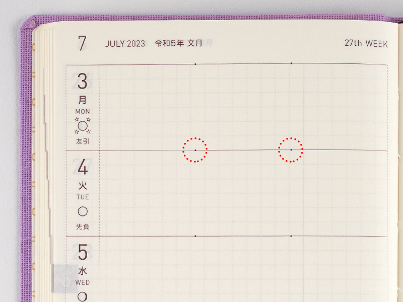
2-dot timeline
In order to facilitate the most efficient use of the limited space in each day, we’ve included two subtle dots to split each day into morning, afternoon, and evening. You can use these however you see fit, such as writing plans in the two left spaces and random notes in the one right space, or disregarding the dots altogether.
![]()
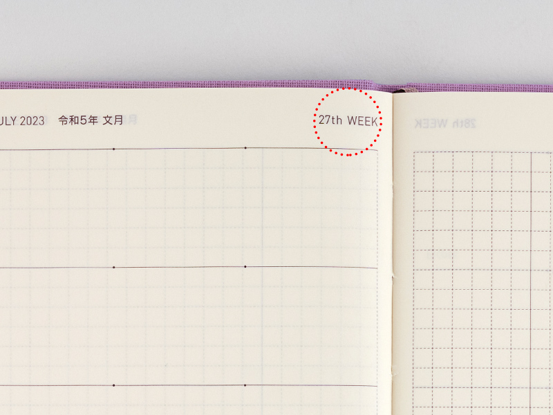
Week number
The daily pages include the number of the week. The formula we use begins with the first week in January that includes a Thursday.
![]()
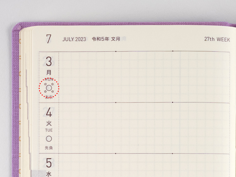
Moon phase and Rokuyo (Traditional Japanese calendar)
An illustration of the current moon phase is paired with the day of the year. The new moon (●) and full moon (○) symbols are surrounded by stars at their peak. (While the moon phase is the same across the world, the exact dates the moon phases land on are listed in Japan time.)
The days are also labeled with rokuyo, a cycle of six days said to predict good or bad fortune that day.
About the English-version Weeks
The English-version Weeks does not list Rokuyo.
![]()
Solar terms (Japanese)
The weekly page shows solar terms that make up the 24 points in traditional East Asian lunisolar calendars. These include well-known days such as the start of spring and the winter solstice.
About the English-version Weeks
The English-versioin Weeks does not list this information.
![]()
Memo page
The right page on each weekly spread contains blank graph paper to give full reign to users when drawing out plans or writing out schedules. You can also draw lines across the page to correspond with each of the 7 days on the left to give yourself more writing room. At 3.55 mm, the graph paper’s grid is slightly smaller than that of the daily planners.
![]()
The “Secret Line”
There’s also something we call the “Secret Line”: a vertical line on the memo page that allows such things as topics on the left and details on the right, or drawing out visual timetables and plans. The line is printed lightly enough that you can ignore it when using the page as a whole.
*Please note, these exchange rate estimates based on open exchange rates are intended as a guide only. The actual rate for your order may differ, as exchange rates change constantly, and international purchase costs vary by credit card.
*The "incl. tax" in the product price means the Japanese consumption tax included. In some countries, packages from Hobonichi may require the payment of customs duty and consumption tax upon arrival.
Service temporarily unavailable


